In today's digital world, the way you collect information from customers, employees, and partners directly impacts your business efficiency and brand perception. Yet many businesses still struggle with clunky, unprofessional forms that frustrate users and result in incomplete data.
Professional online forms can transform your data collection process—reducing abandonment rates by up to 67% and saving countless hours in manual data entry. Whether you're collecting leads, registering attendees, or gathering customer feedback, the quality of your forms matters.
This comprehensive guide will walk you through everything you need to create professional online forms that people actually want to complete.
Why your business needs professional online forms
The shift from paper to digital forms isn't just about being modern—it's about fundamentally improving how your business operates.

The hidden costs of poor form design
When forms are poorly designed or difficult to use, the impact extends far beyond frustrated users:
- Lost revenue: Every abandoned form is a lost opportunity, whether it's a lead, sale, or registration
- Wasted time: Manual data entry from paper forms costs businesses an average of 120 hours per employee annually
- Data errors: Manual transcription introduces errors in up to 4% of records, leading to costly mistakes
- Brand damage: Unprofessional forms create a poor first impression that's hard to overcome
The benefits of professional digital forms
Modern online forms solve these problems while opening new opportunities:
Immediate cost savings: Eliminate printing, storage, and manual data entry costs. The average business saves $8,000 annually per 1,000 forms processed digitally.
Better data quality: Built-in validation ensures you collect accurate, complete information the first time. No more following up to clarify illegible handwriting or missing fields.
Real-time insights: Access responses instantly and analyze trends as data comes in, enabling faster decision-making.
Mobile accessibility: 60% of form submissions now come from mobile devices. Professional online forms adapt to any screen size automatically.
Improved completion rates: Well-designed online forms see 25-40% higher completion rates compared to traditional forms.
Essential features of professional online forms
Not all online forms are created equal. Professional forms that represent your brand well and collect quality data share these key characteristics:
Custom branding and design
Your forms are often a first touchpoint with your business. Generic-looking forms undermine trust and professionalism.
What to look for:
- Custom color schemes matching your brand
- Logo placement options
- Typography control
- Consistent styling across all form elements
With platforms like AskUsers, you can fully customize your forms to match your brand identity, ensuring a cohesive experience whether customers interact with your website, emails, or forms.
Multiple question types
Different information requires different input methods. Professional form builders offer variety:

- Text fields: For open-ended responses
- Email and phone: With built-in validation
- Multiple choice: For single selections
- Checkboxes: For multiple selections
- Rating scales: For feedback and satisfaction scores
- Yes/No buttons: For quick binary decisions
- Reaction buttons: For intuitive emotional feedback
The right question type makes forms easier to complete and yields better data.
Multi-page functionality
Long forms overwhelm users. Breaking forms into logical sections improves completion rates significantly.
Benefits of multi-page forms:
- Reduce cognitive load
- Show progress to motivate completion
- Allow users to save and return later
- Create better flow and organization
Research shows that multi-page forms with progress indicators have 13-15% higher completion rates than single-page equivalents.
Mobile responsiveness
With mobile traffic dominating, forms must work flawlessly on small screens.
Mobile optimization essentials:
- Touch-friendly input fields
- Appropriate keyboard types (number pad for phone numbers)
- Simplified navigation
- Readable text without zooming
- Quick autofill support
Data validation and security
Professional forms prevent errors and protect sensitive information:
- Real-time field validation
- Required field enforcement
- Format checking (email, phone, URL)
- CAPTCHA protection against spam
- Secure data transmission and storage
- GDPR compliance features
Step-by-step guide to creating your first online form
Let's walk through the process of creating a professional online form from scratch.
Step 1: Define your form's purpose and goals
Before opening your form builder, clarity on objectives is essential.
Ask yourself:
- What specific information do I need to collect?
- Who will be filling out this form?
- What will I do with the collected data?
- What action should users take after submitting?
Write a clear purpose statement: "This form will collect [information] from [audience] to [achieve goal]."
Example: "This form will collect contact information and service preferences from potential customers to generate qualified sales leads."
Step 2: Choose the right question types
Match your questions to the data you need:
For contact information:
- Use dedicated email and phone fields with validation
- Text fields for names and addresses
- Keep required fields to a minimum
For preferences and selections:
- Radio buttons when users can select only one option
- Checkboxes when multiple selections are allowed
- Dropdowns for long lists of options (countries, states)
For feedback and ratings:
- Rating scales (1-5 or 1-10) for satisfaction scores
- Yes/No buttons for quick binary feedback
- Reaction buttons for emotional responses
For detailed responses:
- Text areas for comments and descriptions
- Consider word or character limits for consistency
Step 3: Design for user experience
Good form UX means users complete forms without friction:
Logical organization:
- Group related questions together
- Put easier questions first to build momentum
- Save sensitive questions (income, personal details) for later
Clear labeling:
- Use descriptive, specific labels
- Explain why you're asking when necessary
- Indicate which fields are required
Smart defaults:
- Pre-fill information when possible
- Set sensible default selections
- Use placeholder text as examples, not labels
Error handling:
- Validate fields as users complete them
- Show specific, helpful error messages
- Don't clear the entire form on error
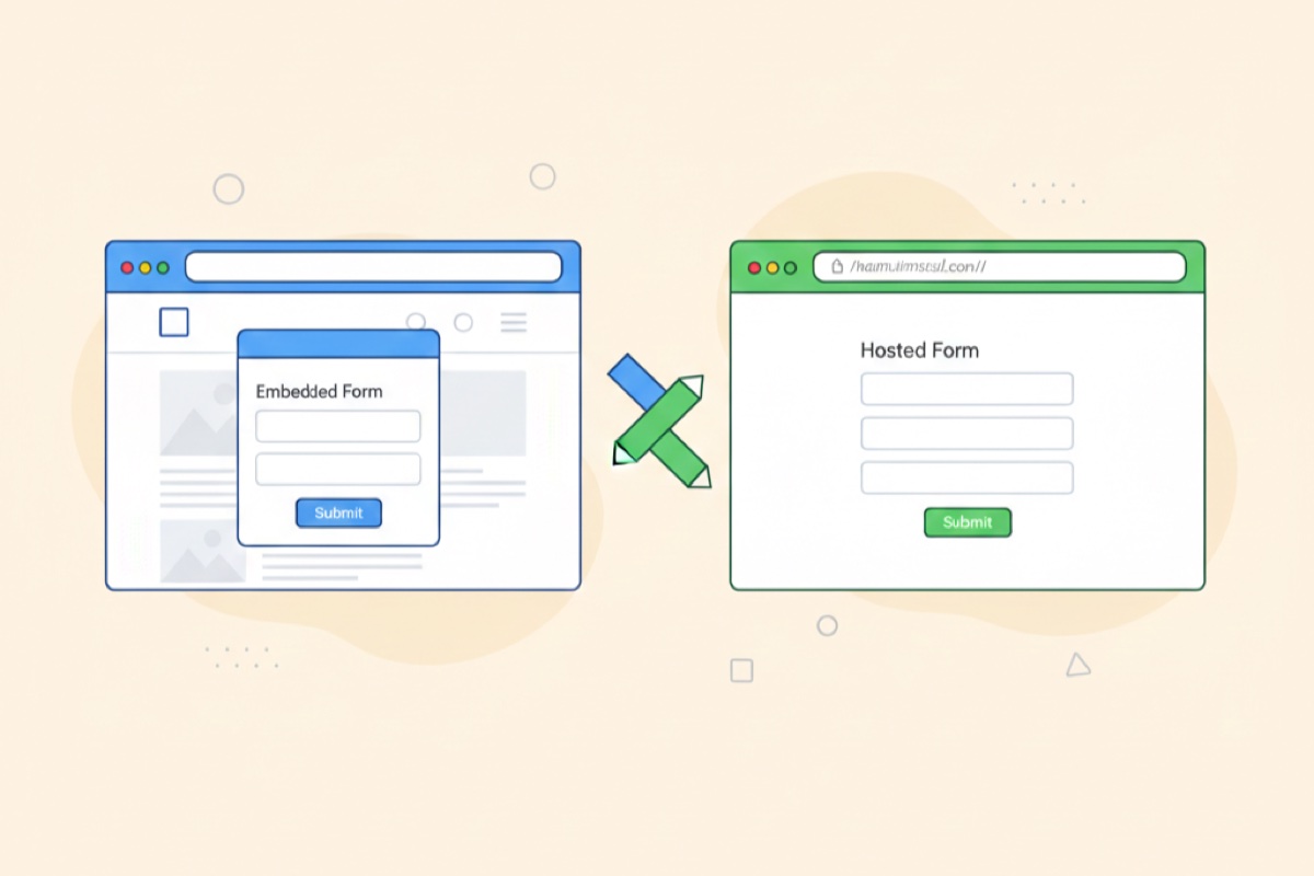
Step 4: Set up hosting and sharing options
Modern form platforms offer flexible deployment options. With AskUsers, you have two powerful ways to share your forms:
Hosted forms with shareable links
Create forms that live on a dedicated URL you can share anywhere:
- Share links via email campaigns
- Post on social media
- Include in QR codes for print materials
- Send directly to specific recipients
- Track which channels drive the most responses
Benefits:
- No technical setup required
- Works immediately after creation
- Professional appearance on any device
- Built-in analytics and tracking
- Easy to update without republishing
Website embedding with widgets
For seamless integration with your website, embed forms directly:
Inline embedding: Place forms naturally within your page content. Perfect for contact forms, registration forms, or surveys as part of your content flow.
Popup widgets: Display forms as popups triggered by user actions (button clicks, time on page, exit intent). Great for lead capture without disrupting the user experience.
Modal dialogs: Show forms in modal overlays that focus user attention. Ideal for important actions like newsletter signups or account registration.
Widget customization options:
- Match your website's exact branding
- Control trigger behavior and timing
- Set display conditions (device type, user behavior)
- Configure opening animations
- Customize button text and styling
The widget approach gives you the best of both worlds—the power of professional forms with complete control over presentation and user experience.
Step 5: Customize branding and styling
Make your form feel like a natural extension of your brand:
Visual branding:
- Upload your logo
- Apply your brand colors to buttons and accents
- Select fonts that match your website
- Configure button styles and borders
Tone and messaging:
- Customize the form title and description
- Write a personalized confirmation message
- Create custom success page content
- Set up automated email responses
Professional platforms like AskUsers make it easy to match your brand perfectly without any coding required.
Step 6: Configure confirmation and follow-up
What happens after submission is just as important as the form itself:
Immediate confirmation:
- Show a clear success message
- Provide next steps or timeline
- Offer a way to contact support
- Include a copy of their responses
Automated emails:
- Send confirmation emails immediately
- Include submission details for their records
- Provide contact information
- Set expectations for response time
Post-submission actions:
- Redirect to relevant content
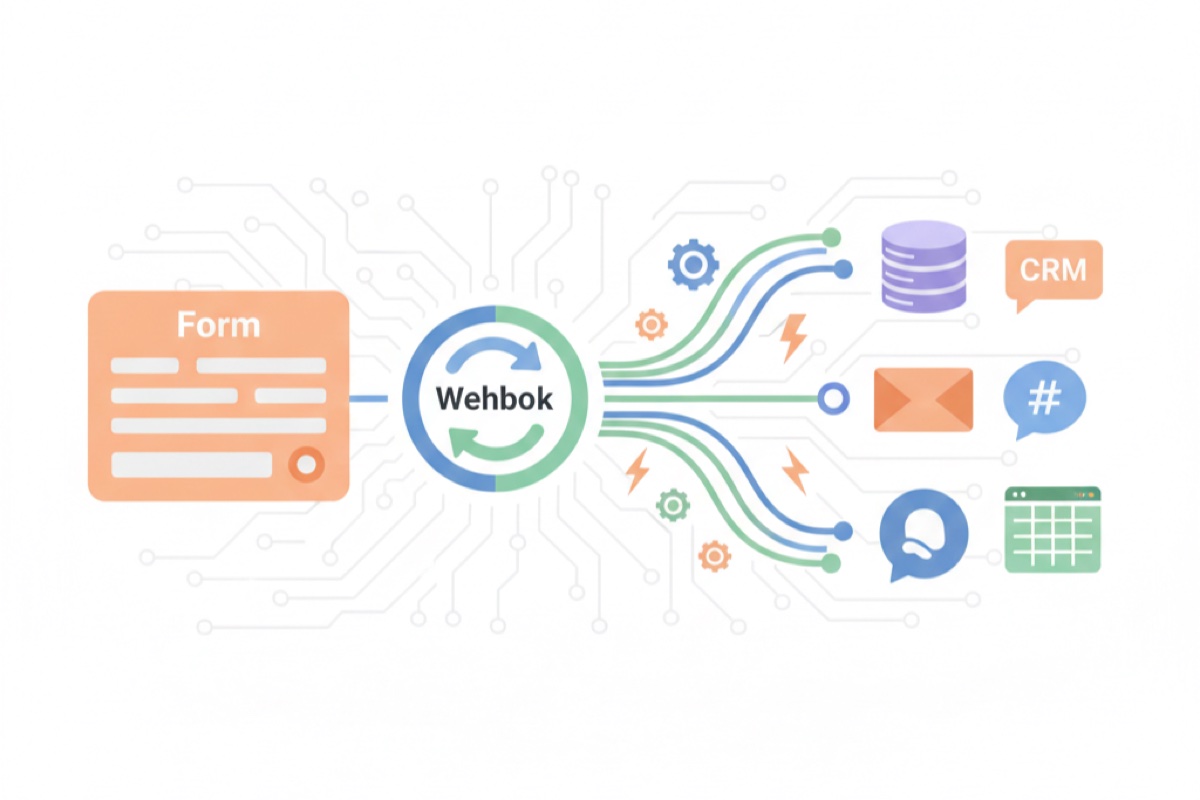
- Trigger integrations with your other tools
- Add contacts to your email list
- Update your CRM automatically
Step 7: Test across devices and scenarios
Before publishing, thorough testing prevents problems:
Test on multiple devices:
- Desktop computers
- Tablets (both orientations)
- Various smartphone sizes
- Different browsers (Chrome, Safari, Firefox, Edge)
Test different scenarios:
- Submit with valid data
- Try to submit incomplete forms
- Enter invalid formats (wrong email, phone)
- Test all conditional logic paths
- Verify all integrations work
Test user experience:
- Can users complete it in under 3 minutes?
- Are error messages clear?
- Does validation work correctly?
- Is the confirmation working?
Step 8: Monitor and optimize
After launching, track performance and improve:
Key metrics to watch:
- Completion rate (target: >70%)
- Average time to complete
- Abandonment points
- Error rates per field
- Submission sources
Optimization strategies:
- Remove or simplify fields with high abandonment
- Test different question orders
- Experiment with multi-page vs single page
- A/B test form titles and descriptions
- Adjust required vs optional fields

10 best practices for high-converting forms
Follow these proven strategies to maximize form completion rates:
1. Keep forms as short as possible
Every additional field decreases completion rates by an average of 4%. Be ruthless:
- Only ask for information you truly need right now
- Can you collect additional details later?
- Remove "nice to have" fields mercilessly
2. Use clear, descriptive labels
Ambiguity kills conversions. Make every field self-explanatory:
- Good: "Work email address"
- Bad: "Email"
- Good: "Mobile phone number for SMS updates"
- Bad: "Phone"
3. Group related fields logically
Help users mentally process your form by organizing it well:
- Group contact info together
- Separate personal from business details
- Use section headers to divide topics
- Consider page breaks for major topic changes
4. Implement inline validation
Don't wait until submission to show errors:
- Validate fields as users complete them
- Show success indicators for correct entries
- Provide specific, actionable error messages
- Never use generic "Invalid input" messages
5. Optimize for mobile first
Design for thumb-sized touch targets and small screens:
- Minimum 44x44 pixel touch areas
- Stack fields vertically, never side-by-side
- Use appropriate input types for mobile keyboards
- Test with actual devices, not just browser simulators
6. Use progress indicators for multi-page forms
Show users how far they've come and how far they have left:
- Display "Step 2 of 4" clearly
- Use progress bars for visual feedback
- Consider showing percentage complete
- Never make progress bars go backwards
7. Minimize required fields
Every required field is a potential abandonment point:
- Mark required fields clearly
- Consider if optional fields are worth including at all
- Ask for optional details on a confirmation page instead
- Remember: shorter forms generally perform better
8. Provide clear value proposition
Tell users why completing your form benefits them:
- Explain what they'll receive
- Set clear expectations (time, followup)
- Show social proof if available
- Make the submit button action-oriented
Example: Instead of "Submit," use "Get My Free Quote" or "Register for the Webinar"
9. Enable autofill and smart defaults
Make completion as effortless as possible:
- Use standard field names for browser autofill
- Pre-select common options
- Remember user preferences
- Use geo-location for country/region when appropriate
10. Test, measure, and iterate
Form optimization is an ongoing process:
- A/B test one change at a time
- Give tests time to gather significant data
- Focus on high-impact changes first
- Document what works and what doesn't
Common use cases and examples
Professional online forms serve countless business purposes. Here are the most common and how to approach them:
Lead generation forms
Purpose: Capture contact information from potential customers
Essential fields:
- Full name or first name only
- Email address (required)
- Phone number (optional, unless for phone sales)
- Company name (for B2B)
- Specific interest or need
Best practices:
- Keep it under 5 fields if possible
- Explain what happens next ("We'll email you within 24 hours")
- Offer something valuable (guide, consultation, demo)
- Make privacy policy link visible
Tip: Use reaction buttons or quick questions to qualify leads ("What's your biggest challenge right now?")
Event registration forms
Purpose: Collect attendee information and manage capacity
Essential fields:
- Full name
- Email address
- Number of tickets/guests
- Dietary restrictions (for catered events)
- Emergency contact (for multi-day events)
Best practices:
- Show remaining capacity to create urgency
- Allow group registrations with one form
- Send automatic calendar invites
- Include clear event details in confirmation
Tip: Use conditional logic to show different questions based on ticket type selected.
Customer feedback forms
Purpose: Gather insights about satisfaction and improvement areas
Essential fields:
- Overall satisfaction rating
- Specific experience questions
- Open comment area
- Contact info (optional, for follow-up)
Best practices:
- Use rating scales for quantitative data
- Include open text for qualitative insights
- Keep it under 10 questions
- Thank customers for their time
Tip: For detailed feedback, link to your survey tools which offer more advanced question logic and analysis.
Contact forms
Purpose: Provide easy way for people to reach your business
Essential fields:
- Name
- Email address
- Subject or topic
- Message
Best practices:
- Place prominently on your website
- Respond within 24 hours
- Auto-confirm receipt
- Provide alternative contact methods
Tip: Consider using a popup or modal form on your website to increase visibility without disrupting content.
Order forms
Purpose: Collect product selections and delivery information
Essential fields:
- Product/service selection
- Quantity
- Delivery address
- Contact information
- Payment method (if not handled elsewhere)
Best practices:
- Show order summary before submission
- Calculate totals in real-time
- Validate address formats
- Provide clear pricing breakdown
Tip: Use multi-page forms to separate product selection, delivery details, and payment for better conversion.
Employee onboarding forms
Purpose: Collect new hire information efficiently
Essential fields:
- Personal information
- Emergency contacts
- Tax information
- Direct deposit details
- Acknowledgments and signatures
Best practices:
- Use multi-page forms for better organization
- Ensure security and privacy compliance
- Allow saving and returning later
- Automatically route to appropriate departments
Tip: Create a branded, professional form experience that makes new hires feel welcome from day one.
How to embed forms on your website
Getting your forms in front of users at the right moment is crucial. Here's how to seamlessly integrate forms into your website:
Inline embedding: natural content flow
Inline forms become part of your page content, ideal for:
- Contact forms on dedicated pages
- Newsletter signups in blog posts
- Registration forms on landing pages
- Support request forms
How it works with AskUsers:
- Create your form in the dashboard
- Go to the "Share" section
- Copy the embed code snippet
- Paste into your website's HTML
- The form displays automatically
Customization options:
- Control form width (fixed or responsive)
- Match your site's typography and colors
- Set custom spacing and margins
- Apply custom CSS for perfect integration
When to use inline:
- When the form is the page's primary purpose
- For content-heavy forms requiring reading
- When users expect to find a form there
- For optimal mobile experience
Popup forms: attention without disruption
Popup forms appear over your content, perfect for:
- Newsletter signups
- Special offers and promotions
- Exit-intent lead capture
- Content upgrades
Trigger options:
- Button or link clicks
- Time delay (after X seconds)
- Scroll percentage (after reading 50%)
- Exit intent (when cursor moves to close)
Best practices:
- Don't show popups immediately on arrival
- Make closing easy and obvious
- Don't show again to users who've dismissed
- Test timing for your specific audience
When to use popups:
- For non-essential but valuable captures
- When you want high visibility
- For time-sensitive offers
- When testing different messages
Modal dialogs: focused attention
Modal forms overlay the entire page with a backdrop, ideal for:
- Account creation
- Important registrations
- Required information collection
- Multi-step processes
Configuration:
- Trigger button text and styling
- Modal size and positioning
- Backdrop transparency
- Close behavior (click outside, X button)
Best practices:
- Use for important actions only
- Keep forms short in modals
- Provide clear close options
- Show progress for multi-step flows
When to use modals:
- For critical user flows
- When you need complete focus
- For processes requiring concentration
- When form completion is mandatory
Technical considerations
Performance:
- Forms load asynchronously (don't slow page load)
- Minimal JavaScript footprint
- Cached for fast subsequent loads
- Mobile-optimized code
Compatibility:
- Works with all major CMS platforms (WordPress, Webflow, Squarespace)
- Compatible with page builders (Elementor, Beaver Builder)
- No conflicts with existing JavaScript
- GDPR-compliant tracking
Customization:
- Add custom CSS classes
- Override default styles
- Control form behavior with JavaScript API
- Integrate with your analytics
Measuring form performance
Creating your form is just the beginning. Continuous measurement and optimization drive results:
Key metrics to track
Completion rate:
- Percentage of users who start and finish your form
- Industry benchmark: 70-85% for short forms
- Calculate: (Submissions ÷ Form views) × 100
Form abandonment rate:
- Percentage who start but don't complete
- Industry benchmark: 15-30%
- Identify: Which fields cause users to quit
Average completion time:
- How long users take to complete
- Target: Under 3 minutes for most forms
- Longer times often indicate confusion
Field-level analytics:
- Time spent on each field
- Error rates per field
- Drop-off points
- Correction rates
Source performance:
- Which channels drive form submissions
- Conversion rates by traffic source
- Device breakdown (desktop vs mobile)
- Browser and operating system data
Using analytics for optimization
Identify problem areas:
- Fields with high abandonment? Consider removing or clarifying
- Fields with many errors? Improve validation or instructions
- Unusually long completion times? Simplify or break into pages
- Mobile abandonment higher? Test mobile UX thoroughly
A/B testing strategies:
Test one variable at a time:
- Form length (7 fields vs 5 fields)
- Question order
- Submit button text
- Single page vs multi-page
- Required vs optional fields
Form optimization cycle:
- Identify metric to improve (completion rate)
- Hypothesize what might help (reduce from 8 to 5 fields)
- Create test variant
- Run test for statistical significance
- Implement winner, document learning
- Choose next metric to optimize
Conversion rate benchmarks
By industry:
- B2B services: 2-5%
- E-commerce: 1-3%
- SaaS: 3-7%
- Education: 5-10%
- Healthcare: 3-8%
By form length:
- 1-3 fields: 15-25% conversion
- 4-6 fields: 10-15% conversion
- 7-10 fields: 5-10% conversion
- 10+ fields: 3-5% conversion
By device:
- Desktop: 70-85% completion
- Mobile: 60-75% completion
- Tablet: 65-80% completion
Note: These are general benchmarks. Your specific rates depend on traffic quality, offer value, and form quality.
Advanced analysis techniques
Cohort analysis:
- Compare performance across user segments
- Identify which audiences convert best
- Tailor forms to different user types
Funnel analysis:
- Track user journey to your form
- Identify where users come from
- Optimize earlier steps in the funnel
Heatmap analysis:
- See where users click and hesitate
- Identify confusing form elements
- Understand user behavior patterns
Session recordings:
- Watch actual users complete forms
- Spot usability issues you missed
- Understand frustration points
Getting started with AskUsers
Now that you understand what makes professional online forms effective, you're ready to create your own.
Why choose AskUsers for your forms
Ease of use: Create professional forms in minutes without any technical skills. Our intuitive interface guides you through every step.
Flexible deployment: Whether you need a hosted form with a shareable link or seamless website integration with widgets, AskUsers supports both approaches perfectly.
Professional appearance: Custom branding, responsive design, and polished UI ensure your forms represent your brand beautifully on any device.
Powerful features: From basic contact forms to complex multi-page forms with conditional logic, AskUsers scales with your needs.
Built-in analytics: Understand form performance with detailed metrics and insights. Track completions, identify drop-off points, and optimize continuously.
Reliable and secure: Your data is protected with enterprise-grade security, GDPR compliance, and 99.9% uptime.
Next steps
Ready to transform your data collection process?
- Start free: Create your account and build your first form in under 10 minutes
- Explore templates: Get inspired by pre-built forms for common use cases
- Customize branding: Make your forms uniquely yours with custom colors, fonts, and logos
- Deploy and share: Choose hosted links or embed widgets—or use both
- Measure and optimize: Use built-in analytics to continually improve performance
Professional online forms aren't just about collecting data—they're about creating better experiences for your customers while making your business more efficient.