Mobile devices account for over 60% of web traffic, yet mobile form completion rates are 20-30% lower than desktop. The problem? Most forms are designed for desktop and awkwardly adapted for mobile, creating frustration that drives users away.
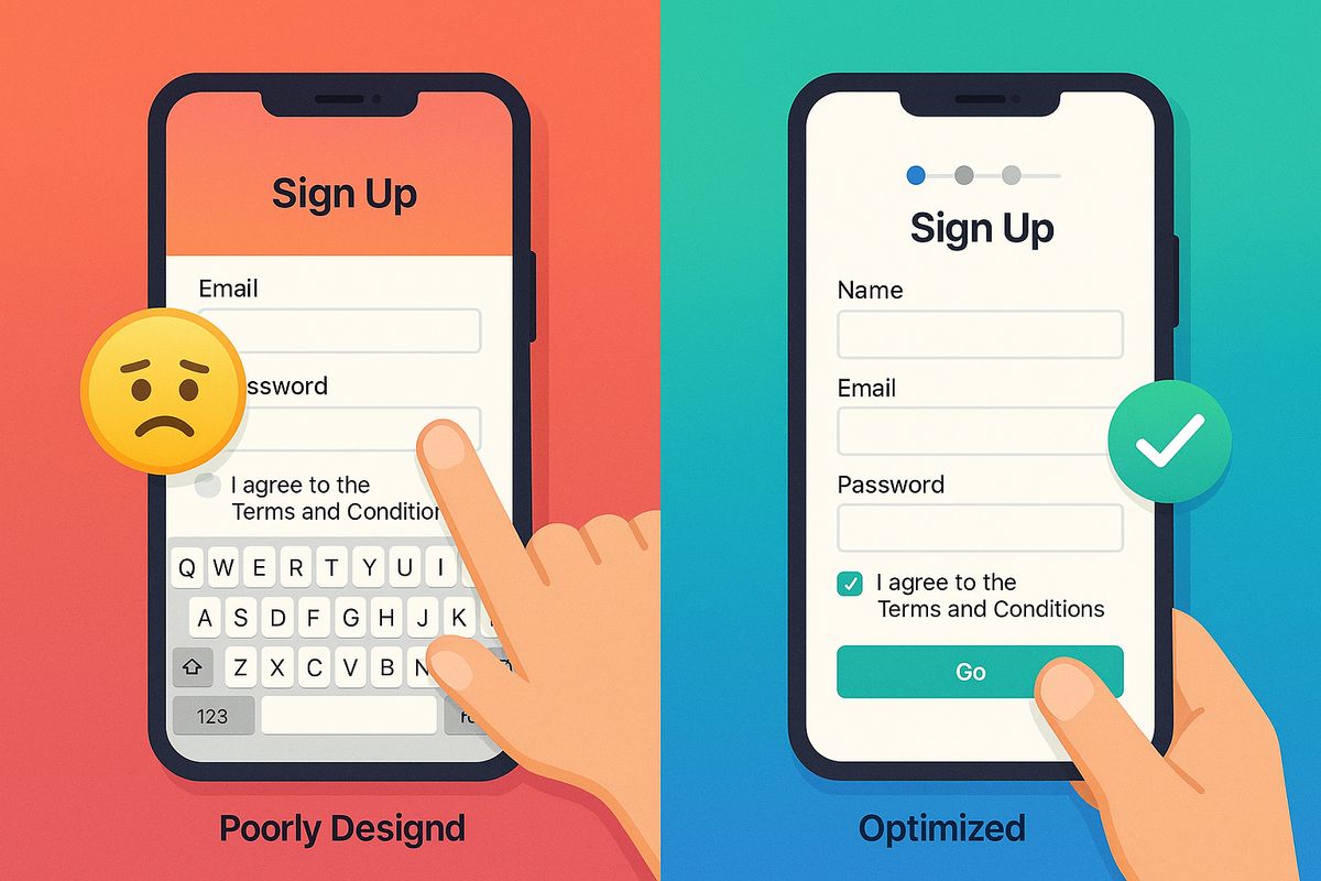
Mobile form optimization isn't just about making forms smaller—it requires fundamentally rethinking form design for touch interfaces, smaller screens, and on-the-go contexts. A well-optimized mobile form can achieve completion rates rivaling desktop, while a poorly designed one will hemorrhage conversions.
In this comprehensive guide, you'll learn exactly why users abandon mobile forms, discover mobile-specific design patterns that work, and implement proven optimization techniques to dramatically improve your mobile completion rates.
The mobile form challenge: understanding the gap
Desktop forms convert at average rates of 40-50% across industries. Mobile forms? Just 25-35%. That's a massive conversion loss that directly impacts your bottom line.
Why mobile is fundamentally different
Screen real estate: Mobile screens are 5-10x smaller than desktop, making it harder to see form context, instructions, and progress.
Touch interface: Fingers are 44-57 pixels wide, far less precise than mouse cursors. Small targets lead to tap errors and frustration.
Keyboard constraints: Mobile keyboards consume 50%+ of screen space, hiding form context and making navigation difficult.
Context of use: Mobile users are often distracted, on-the-go, or multitasking. They have less patience for complex forms.
Connection variability: Mobile users may have slower, less reliable connections, making heavy forms problematic.
The opportunity: Companies that optimize for mobile see 25-50% increases in mobile conversion rates, directly boosting overall conversions without spending more on traffic.
The 10 deadly sins of mobile form design
Before we dive into solutions, let's identify the specific problems killing your mobile conversions:
1. Touch targets too small
Buttons, checkboxes, and input fields under 44×44 pixels are difficult to tap accurately, leading to errors and rage-tapping.
The impact: Users accidentally tap wrong fields, trigger incorrect selections, and abandon out of frustration.
2. Wrong keyboard types
Showing the default keyboard for phone numbers or email addresses forces users to manually switch keyboards.
The impact: Extra taps, slower completion, and increased cognitive load.
3. Multi-column layouts
Side-by-side fields require horizontal scrolling or tiny fonts on mobile screens.
The impact: Confusion, missed fields, and accidental form abandonment.
4. Tiny text and poor contrast
Text below 16px requires zooming, while low contrast is illegible in sunlight.
The impact: Eye strain, errors from misreading, accessibility failures.
5. Hidden labels and placeholder-only text
When keyboards appear, placeholders disappear, leaving users confused about what field they're filling.
The impact: Uncertainty, errors, and form abandonment mid-completion.
6. Long forms without progress indicators
Users can't gauge how much more effort is required, making them more likely to quit.
The impact: Higher mid-form abandonment, especially on longer forms.
7. Poor error handling
Errors shown only after submission, with vague messages, require users to hunt for problems.
The impact: Frustration peaks, abandonment spikes dramatically.
8. Disabled autofill and autocomplete
Forcing users to manually type every character on mobile is painful.
The impact: Slower completion, higher errors, increased abandonment.
9. Submit buttons below the fold
Users don't realize the form continues or where to submit.
The impact: Confusion, incomplete submissions, abandonment.
10. Heavy pages with slow load times
Forms that take more than 3 seconds to load lose 40% of users immediately.
The impact: High bounce rates before users even attempt the form.
Mobile form optimization: the essential checklist
Let's fix each problem with specific, actionable optimizations:
1. Optimize touch targets for fingers, not cursors
Minimum touch target sizes:
- Buttons and CTAs: 44×44 pixels minimum (Apple), 48×48 pixels recommended (Google)
- Input fields: 44 pixels tall minimum for comfortable tapping
- Checkboxes and radio buttons: 44×44 pixels including surrounding padding
- Clickable labels: Make entire label tappable, not just the tiny checkbox
Spacing between interactive elements:
- Minimum 8 pixels between form fields
- 16-24 pixels ideal for comfortable one-thumb usage
- Extra spacing in thumb zones (bottom third of screen)
Before/after example:
❌ Checkbox 16×16px with 4px spacing: Constant mis-taps, frustration
✅ Checkbox 48×48px with 16px spacing: Easy, accurate selection
Quick win: Simply increasing touch target sizes from 30px to 48px improved conversion rates by 14% in A/B tests across multiple industries.
2. Use contextual keyboards for every input type
Show the right keyboard automatically to minimize user effort:
HTML input types that trigger contextual keyboards:
type="tel": Shows number pad for phone numberstype="email": Shows keyboard with @ and .com keystype="url": Shows keyboard with .com and / keystype="number": Shows numeric keyboard for quantities, IDstype="date": Shows native date picker (avoids keyboard entirely)type="search": Shows keyboard with search button instead of return
Input attributes for better keyboard behavior:
inputmode="numeric": Number keyboard without negative/decimal optionsinputmode="decimal": Number keyboard with decimal pointautocomplete="email": Enables autofill, suggests saved emailsautocapitalize="words": Automatically capitalizes namesautocorrect="off": Disables autocorrect for usernames, codes
Example markup:
<input
  type="tel"
  autocomplete="tel"
  inputmode="numeric"
  placeholder="(555) 123-4567"
  aria-label="Phone number"
/>
This triggers the number pad, enables autofill from saved contacts, and provides clear labeling for accessibility.
3. Use single-column layouts always
Mobile screens cannot accommodate side-by-side fields without compromising usability.
Single-column benefits:
- No horizontal scrolling or zooming required
- Clear, linear progression through fields
- Easier to scan and understand structure
- More space for larger touch targets
- Better accessibility for screen readers
Exception: Very short, related fields like City + State or First + Last name can be side-by-side if each field remains at least 120px wide.
Responsive design approach:
- Desktop: Multi-column layouts acceptable (2-3 columns)
- Tablet: 1-2 columns depending on orientation
- Mobile: Always single column, no exceptions
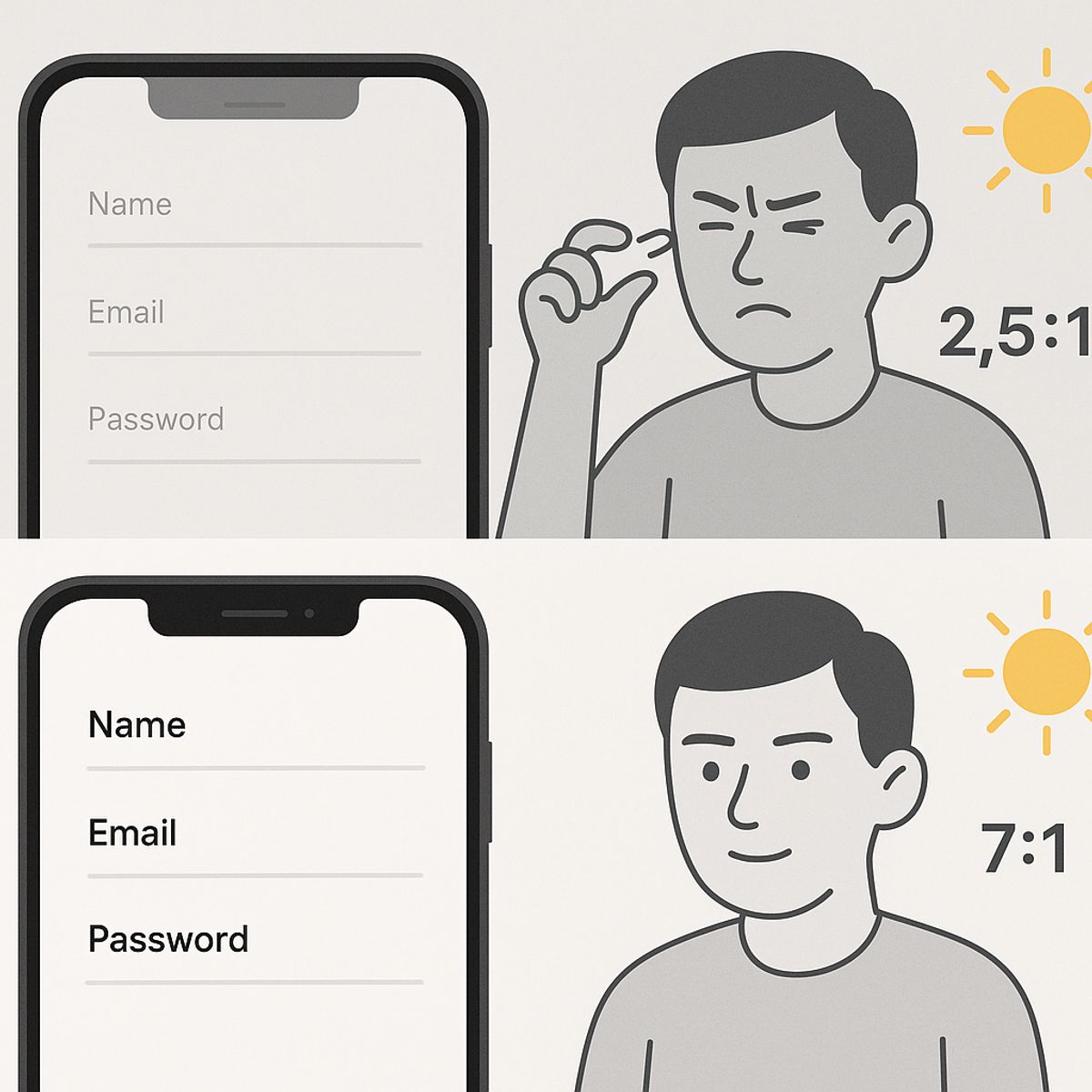
4. Make text readable without zooming
Typography standards for mobile:
- Input text: 16px minimum (iOS won't auto-zoom at 16px+)
- Labels: 14-16px for readability
- Placeholder text: 16px, reduced opacity (not too light)
- Error messages: 14px minimum, high contrast red
- Helper text: 12-14px acceptable for non-critical info
- Buttons: 16-18px for clear readability
Contrast requirements:
- Text: Minimum 4.5:1 contrast ratio (WCAG AA standard)
- Large text (18px+): Minimum 3:1 contrast ratio
- Test in bright sunlight conditions, not just office lighting
- Avoid light gray text on white backgrounds (<3:1 contrast)
5. Keep labels visible when keyboards appear
Never rely solely on placeholder text—it disappears when users start typing.
Best practices for labels:
- Floating labels: Placeholders animate to labels above fields when focused
- Top-aligned labels: Traditional labels above fields, always visible
- Inline labels: Labels inside fields that move up when focused (Material Design pattern)
Avoid:
- ❌ Placeholder-only design (placeholder disappears when typing)
- ❌ Left-aligned labels (waste horizontal space on mobile)
- ❌ Labels that disappear completely
Why this matters: When users switch back to a field after filling others, they need to see what the field is for without deleting their content.
6. Show progress and set expectations
Mobile users need clear visibility into form length and progress.
Progress indicators:
- Multi-page forms: Show "Step 2 of 4" or progress bar at top
- Single-page forms: Group fields with headings, show percentage complete
- Estimated time: "Takes less than 2 minutes" sets expectations
Progressive disclosure:
- Show 3-5 fields at a time, reveal more as users progress
- Hide advanced or optional fields behind "More options" toggles
- Use conditional logic to skip irrelevant fields
Psychological impact: Progress indicators reduce abandonment by 10-15% by making forms feel achievable.
7. Implement inline validation with helpful errors
Real-time feedback prevents submission failures and reduces frustration.
Inline validation rules:
- Validate on blur (when user leaves field), not while typing
- Show ✓ green checkmarks for correct entries
- Display ✗ specific error messages immediately for incorrect entries
- Never clear field contents when showing errors
- Position errors directly below fields, not at form top
Error message quality:
❌ Bad: "Invalid input"
✅ Good: "Email address must include @"
❌ Bad: "Error: Phone number"
✅ Good: "Phone number should be 10 digits: (555) 123-4567"
❌ Bad: "Password doesn't meet requirements"
✅ Good: "Password must be at least 8 characters and include one number"
Proactive requirements:
- Show password requirements before users type
- Display format examples in placeholders: "(555) 123-4567"
- Use helper text for complex fields: "Format: MM/DD/YYYY"
8. Enable and optimize autofill
Autofill can reduce form completion time by 30-50% on mobile.
HTML autocomplete attributes:
<input type="text" autocomplete="name" />
<input type="email" autocomplete="email" />
<input type="tel" autocomplete="tel" />
<input type="text" autocomplete="address-line1" />
<input type="text" autocomplete="address-line2" />
<input type="text" autocomplete="postal-code" />
<input type="text" autocomplete="cc-number" />
<input type="text" autocomplete="cc-exp" />
Full name vs. split names:
- Mobile: Use single "Full name" field (easier autofill)
- Desktop: First/Last name split acceptable if needed
- Reason: Mobile autofill works better with full name fields
Testing autofill:
- Test on iOS Safari (60%+ of mobile browsers)
- Test on Chrome mobile (30%+ of mobile browsers)
- Verify contact info autofills from phone contacts
- Check that credit card autofill works (if applicable)
Impact data: Forms with working autofill see 25-35% higher mobile completion rates. Never disable autocomplete.
9. Make submit buttons prominent and accessible
Submit button design:
- Size: Full-width or minimum 250px wide, 48px tall
- Color: High contrast, stands out from form fields
- Position: Fixed to bottom of screen OR visible without scrolling
- Label: Action-oriented ("Submit" → "Get My Free Trial")
- Loading state: Show spinner on submit, disable to prevent double-tap
Sticky submit buttons:
For longer forms, consider a fixed bottom button that remains visible as users scroll. Ensure it doesn't cover form content.
Avoid:
- Small buttons (<44px tall) that are hard to tap
- Buttons far below the fold requiring excessive scrolling
- Unclear button labels ("Submit", "Continue", "OK")
- Buttons that remain active during submission (allow double-submission)
10. Optimize performance and load times
Mobile users on 4G/5G still experience slower speeds than desktop broadband.
Performance optimization checklist:
- Lazy load: Don't load entire form at once; progressive enhancement
- Minimize JavaScript: Heavy form libraries slow mobile rendering
- Optimize images: Compress, use WebP, serve responsive sizes
- Inline critical CSS: Reduce render-blocking resources
- Server-side validation: But provide instant client-side feedback
- Prefetch resources: Load likely next steps before users click
Performance targets:
- Initial load: <2 seconds on 4G
- Time to interactive: <3 seconds
- Field interactions: <100ms response time
- Form submission: <1 second to acknowledgment
Testing performance:
- Use Chrome DevTools throttling (4G, 3G) to simulate real conditions
- Test on actual mobile devices, not just desktop browser emulation
- Monitor Core Web Vitals: LCP, FID, CLS
Advanced mobile form patterns
Smart field ordering for mobile
The order of fields dramatically impacts mobile completion rates.
Optimal ordering:
- Start with easiest: Name, email (quick wins build momentum)
- Group related fields: All contact info together, all payment together
- Delay sensitive fields: Phone numbers, payment info after investment
- Optional fields last: Don't lose users on non-essential questions
- End with commitment: Terms agreement, submit button
Why order matters on mobile: Small screens make it harder to see overall form structure. Users judge form length by what they see first. Starting with hard or numerous fields increases abandonment.
Input masks and formatting
Auto-formatting reduces errors and cognitive load on mobile.
Effective input masks:
- Phone numbers: Auto-format as users type: (555) 123-4567
- Credit cards: Add spaces every 4 digits: 1234 5678 9012 3456
- Dates: Auto-insert slashes: 12/25/2025
- Social security: Auto-format: 123-45-6789
Implementation tips:
- Format as users type, don't wait for blur
- Allow pasting of unformatted data (strip and reformat)
- Show format examples in placeholders
- Submit clean data to server (remove formatting characters)
Conditional logic and dynamic forms
Show only relevant fields based on previous answers.
Examples:
- "Are you a new customer?" → Yes shows registration fields, No shows login
- "Shipping same as billing?" → Yes hides shipping address fields
- "Business or personal account?" → Shows different fields per type
Benefits for mobile:
- Shorter apparent form length
- Reduced scrolling and cognitive load
- Faster completion times
- Lower abandonment rates (10-20% improvement)
Multi-step forms with smart transitions
Break long forms into manageable chunks.
When to use multi-step:
- Forms with 8+ fields
- Forms mixing different types of information (contact, payment, preferences)
- Forms where early questions determine later fields
Multi-step best practices:
- 3-5 fields per step maximum
- Clear progress indicator ("Step 2 of 4")
- Allow back navigation without losing data
- Auto-save progress between steps
- Smooth transitions (slide animations, not jarring page loads)
When single-page is better:
- Forms with <6 fields
- Forms where users need to see all questions before answering
- Forms where relationship between fields is important
Testing your mobile forms
Optimization without testing is guesswork. Here's how to validate your improvements:
Device and browser testing
Essential test matrix:
- iOS Safari: iPhone 12-15 Pro (16+ iOS versions)
- Chrome mobile: Android phones (various manufacturers)
- Samsung Internet: Popular on Samsung devices
- Screen sizes: Small (iPhone SE), Medium (iPhone 15), Large (iPhone 15 Pro Max)
- Orientations: Portrait (primary) and landscape
What to test:
- ✓ All fields render properly without horizontal scrolling
- ✓ Touch targets are easy to tap accurately
- ✓ Keyboards show correct type for each input
- ✓ Autofill works as expected
- ✓ Validation appears correctly
- ✓ Submit button is accessible without excessive scrolling
- ✓ Form completes successfully and shows confirmation
Usability testing with real users
Moderated testing:
- Recruit 5-8 users representing your target audience
- Ask them to complete form while thinking aloud
- Observe where they hesitate, make errors, or express frustration
- Note any unexpected behaviors or workarounds
Questions to ask post-completion:
- "Was anything confusing or frustrating?"
- "Did you feel confident the form was working correctly?"
- "How long did you feel the form took?"
- "Would you complete this form on mobile or wait for desktop?"
Analytics and A/B testing
Metrics to track:
- Mobile completion rate: Completions ÷ views (track separately from desktop)
- Field-level abandonment: Last field interacted with before abandoning
- Time to completion: Average time for successful submissions
- Error rates per field: How often users trigger validation errors
- Device breakdown: iOS vs Android, screen sizes, browsers
A/B test prioritization:
- Number of fields (biggest impact)
- Single-page vs multi-step
- Field order
- Button size and placement
- Label positioning
Statistical significance: Run tests until you have at least 100 mobile conversions per variant. Mobile traffic varies by time and day, so test for full weeks.
Case study: 127% increase in mobile conversions
An e-commerce company struggled with 18% mobile checkout completion (vs 52% desktop). Here's what they changed:
Original mobile form problems:
- 11 fields on single page
- First name/Last name side-by-side (too narrow)
- Tiny radio buttons for shipping options
- Submit button 40px below fold
- No autofill attributes
- Validation only after submission
- 14px input text (caused zoom on iOS)
Changes implemented:
- Reduced to 7 fields (combined name, removed optional fields)
- Changed to single-column layout
- Increased all touch targets to 48×48px
- Added proper input types and autocomplete attributes
- Implemented inline validation with clear error messages
- Increased input text to 16px
- Made submit button sticky at bottom of viewport
- Added progress indicator showing "Step 1 of 2"
- Split into two steps: Contact + Payment
Results after 4 weeks:
- Mobile completion rate: 18% → 41% (+127% improvement)
- Average completion time: 4:20 → 2:15 (48% faster)
- Error rate per user: 2.3 → 0.7 (70% reduction)
- Mobile revenue: +89% increase
- Desktop completion unchanged (52%), proving mobile-specific issues
Key takeaway: The biggest gains came from field reduction, proper touch targets, and split steps—the fundamentals of mobile optimization.
Mobile form optimization tools
Design and development tools
Chrome DevTools Device Mode: Simulate mobile devices, test responsive design, throttle network
BrowserStack / Sauce Labs: Test on real devices remotely without maintaining physical device lab
Responsive design checkers: Tools like Responsively App let you view multiple screen sizes simultaneously
Contrast checkers: WebAIM Contrast Checker ensures readability
Form platforms with mobile optimization
AskUsers: Create mobile-responsive forms with session analytics showing mobile vs desktop performance. Built-in responsive design ensures forms adapt automatically to all screen sizes and devices.
Benefits of form platforms:
- Mobile-responsive templates out of the box
- Automatic responsive design
- Built-in analytics showing mobile-specific metrics
- Device and browser breakdown tracking
Analytics tools
Google Analytics 4: Track mobile completion rates, set up mobile-specific events, analyze device breakdowns
Hotjar / FullStory: Session recordings show exactly how mobile users interact with forms, revealing usability issues
Form-specific analytics: Tools that track field-level engagement, abandonment points, and error rates
Quick wins: mobile optimizations you can implement today
Start with these high-impact, low-effort improvements:
30-minute optimizations
- Add proper input types: Change type="text" to type="email", type="tel", etc.
- Increase input font size: Set all inputs to 16px minimum
- Add autocomplete attributes: Enable browser autofill
- Make buttons bigger: Increase to 48px height minimum
2-hour optimizations
- Convert to single-column: Remove all side-by-side layouts on mobile
- Increase all touch targets: Make checkboxes, radio buttons 48×48px
- Add inline validation: Implement real-time error checking
- Improve button placement: Make submit visible without scrolling
1-day optimizations
- Remove unnecessary fields: Cut form to essential-only on mobile
- Implement multi-step: Split long forms into 2-3 steps
- Add progress indicator: Show completion status
- Optimize performance: Reduce file sizes, improve load times
The future of mobile forms
Mobile form technology continues to evolve:
Emerging trends:
- Biometric autofill: Face ID / Touch ID for instant form completion
- Voice input: Dictation for longer text fields
- Smart defaults: AI-powered field prediction based on context
- Progressive Web Apps: App-like form experiences without app installation
- Camera-based input: Scan credit cards, IDs, documents to auto-fill
While these innovations are exciting, fundamental mobile UX principles remain constant: make tapping easy, minimize typing, provide clear feedback, and optimize for one-handed use.
Conclusion: mobile optimization is mandatory, not optional
With mobile traffic dominating web usage, forms optimized only for desktop are leaving massive revenue on the table. The good news? Mobile optimization is entirely within your control and doesn't require additional traffic spend.
Your action plan:
- Audit current mobile performance: Check your mobile completion rate vs desktop
- Identify quick wins: Input types, touch target sizes, single-column layout
- Test on real devices: Use actual iPhones and Android phones, not just emulators
- Implement systematically: Start with fundamentals, then advanced patterns
- Measure impact: Track mobile-specific metrics before and after changes
- Iterate continuously: Mobile devices and user expectations evolve constantly
Every improvement you make compounds. A form that's 10% easier to complete on mobile can mean 20-30% more conversions, translating to significant business impact without spending more on customer acquisition.
Create mobile-responsive forms effortlessly
AskUsers creates fully responsive forms that adapt automatically to mobile devices. Track mobile vs desktop performance with built-in session analytics to understand how users interact across different devices.