
Every year, businesses lose millions of potential customers, leads, and valuable data simply because users abandon their online forms. With average abandonment rates hovering around 68% across industries, form abandonment is one of the most critical—yet fixable—problems in digital user experience.
The good news? Form abandonment is measurable, trackable, and most importantly, preventable. By understanding why users abandon forms and implementing data-driven optimization strategies, you can dramatically increase completion rates and recover lost conversions.
In this comprehensive guide, we'll explore the psychology behind form abandonment, show you how to track it effectively, and provide actionable strategies to reduce abandonment and boost your form completion rates.
What is form abandonment?
Form abandonment occurs when a user starts filling out a form but leaves before completing and submitting it. Unlike users who simply view a form and decide not to engage, abandoners demonstrate clear intent by interacting with form fields—making their departure particularly frustrating for businesses.
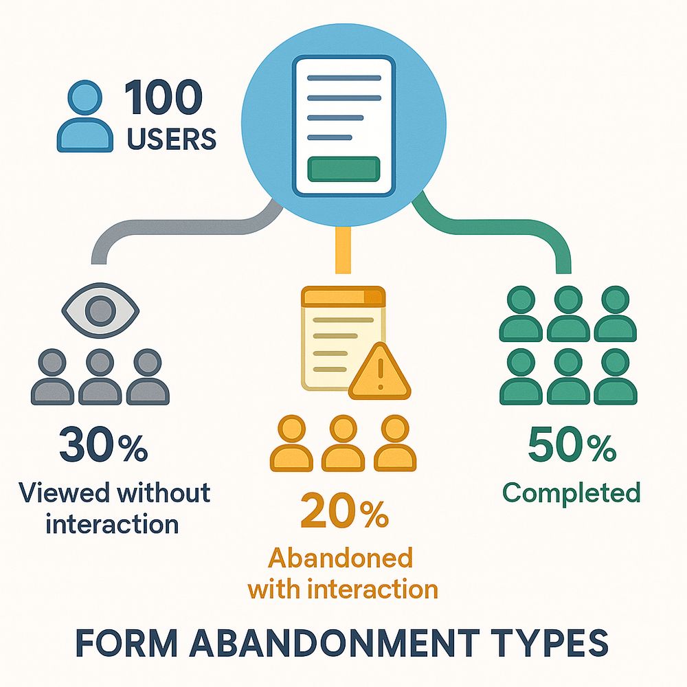
Understanding different types of form abandonment
Viewed without interaction: Users land on your form page but never click into any field. This often indicates poor value proposition or unclear purpose rather than form usability issues.
Abandoned with interaction: Users start filling out fields but leave before submission. This is true form abandonment and typically results from UX issues, trust concerns, or excessive friction.
Multiple attempts: Users complete your form multiple times from the same session. While this might seem positive, it often indicates confusion, errors, or submission problems that need investigation.
The true cost of form abandonment
Form abandonment doesn't just represent lost submissions—it compounds across your entire business:
- Lost revenue: E-commerce checkout abandonment alone costs businesses $18 billion annually in the US
- Wasted marketing spend: You've paid to drive traffic to your form, only to lose conversions at the final step
- Damaged brand perception: Frustrated users may not return, viewing your business as unprofessional or difficult
- Skewed data: High abandonment means you're only hearing from users patient enough to complete, missing valuable insights
- Reduced ROI: Every percentage point improvement in completion rates directly impacts your bottom line
Key statistic: For every 100 users who start your form, improving completion rates from 30% to 40% means 33% more conversions—without spending a dollar on additional traffic.
Why users abandon forms: the root causes
Understanding the "why" behind abandonment is crucial for fixing it. Research and user testing reveal several common culprits:
1. Forms are too long or complex
This is the number one reason users cite for abandoning forms. Every additional field decreases completion rates by approximately 4-5%.
What users experience:
- Overwhelm when seeing 10+ fields
- Frustration at providing unnecessary information
- Time pressure (forms taking longer than expected)
- Cognitive fatigue from complex questions
Data shows: Forms with 3-4 fields see 70-85% completion rates, while forms with 10+ fields drop to 30-40% completion.
2. Trust and privacy concerns
Users are increasingly protective of their personal information, especially when forms request sensitive data.
Red flags that trigger abandonment:
- Asking for phone numbers without explanation
- Requesting social security or financial information without visible security indicators
- Vague privacy policies or no privacy policy link
- Forms on non-HTTPS sites
- Unclear data usage ("Why do you need my birthday?")
Studies show that 81% of users have abandoned forms due to concerns about how their data would be used.
3. Mobile UX problems
With 60%+ of form traffic coming from mobile devices, mobile-unfriendly forms are abandonment disasters.
Common mobile friction points:
- Touch targets too small for accurate tapping
- Wrong keyboard types (default keyboard for phone numbers)
- Forms requiring horizontal scrolling
- Text too small without zooming
- Multi-column layouts that don't stack properly
- Submit buttons below the fold
Mobile users abandon forms at rates 20-30% higher than desktop users when forms aren't optimized.
4. Poor error handling and validation
Nothing frustrates users more than cryptic error messages or losing all their data after a single mistake.
Abandonment-inducing error patterns:
- Errors only shown after submission attempt
- Vague messages like "Invalid input"
- Clearing all fields when one error occurs
- Password requirements not communicated upfront
- Format requirements unclear (phone number, date)
Improvement opportunity: Inline validation reduces form errors by 22% and abandonment by 10-15%.
5. Unclear value proposition
If users don't understand what they're getting in exchange for their information, they won't complete the form.
Missing elements:
- No explanation of benefits ("Why should I fill this out?")
- Unclear next steps after submission
- Generic submit buttons ("Submit" vs "Get My Free Quote")
- No indication of time required
- Missing social proof or testimonials
6. Technical issues and slow performance
Technical problems silently kill conversions without users even reporting them.
Common technical abandonment causes:
- Forms that don't load on certain browsers
- Slow response times (>3 seconds)
- Autofill not working
- Forms breaking on specific devices
- Submit button not working
- Page refreshing unexpectedly
7. Asking for information too early
Requesting extensive information before establishing value creates psychological resistance.
Examples of premature data requests:
- Asking for credit card before a free trial
- Requiring phone number for email newsletter
- Multi-page registration before showing product value
- Detailed demographics for simple downloads
Progressive disclosure—collecting minimal information initially and requesting more details later—can improve completion rates by 20-40%.
How to track and measure form abandonment
You can't optimize what you don't measure. Effective form analytics reveal exactly where and why users abandon.
Essential metrics to track
Form abandonment rate:
- Formula: (Users who interacted - Completions) ÷ Users who interacted × 100
- Industry benchmark: 30-40% (lower is better)
- Track by device, traffic source, and user segment
Form completion rate:
- Formula: Completions ÷ Form views × 100
- Accounts for both engaged and non-engaged users
- Benchmark: 10-30% depending on form purpose
Field-level abandonment:
- Identify which specific field users quit at
- Essential for pinpointing friction points
- Track "last field focused" before abandonment
Time to completion:
- Average time users spend on your form
- Target: Under 2-3 minutes for most forms
- Unusually long times indicate confusion
Error rate per field:
- How often users encounter errors on each field
- High error rates signal poor validation or unclear requirements
Session-based analytics: the complete picture
Traditional form analytics track individual submissions, but session-based analytics reveal the full user journey—including multiple attempts, partial completions, and abandonment patterns.
What session analytics shows:
- Completed sessions: Users who successfully submitted the form
- Abandoned with interaction: Users who started but didn't complete
- Viewed without interaction: Users who saw the form but never engaged
- Multiple submissions: Sessions with more than one form submission (may indicate errors or confusion)
- Last field focused: Exactly where users abandoned
- Total actions: Level of user engagement before abandoning
Modern form platforms like AskUsers provide comprehensive session analytics that track every user interaction, giving you unprecedented visibility into form performance and abandonment patterns.
Pro tip: Session analytics helps you differentiate between users who bounced quickly (possibly poor form fit) versus users who spent significant time but still abandoned (likely usability or trust issues).
Setting up abandonment tracking
For hosted forms:
- Use form builder platforms with built-in analytics
- Track form views, starts, and completions automatically
- Monitor field-level interactions
- Review session data regularly
For embedded forms:
- Implement form analytics via your form platform
- Set up event tracking in Google Analytics (form_start, form_abandon, form_complete)
- Track which pages host high-converting vs high-abandoning forms
- Monitor device and browser differences
Advanced tracking:
- Set up funnel analysis to see user path to forms
- Use session recording tools to watch actual user interactions
- Implement heatmaps to see where users click and hover
- Track cursor movement and rage clicks (rapid clicking indicating frustration)
10 proven strategies to reduce form abandonment
Now that you understand why users abandon and how to track it, let's explore actionable strategies to reduce abandonment and increase completions.
1. Ruthlessly minimize form fields
The single most effective way to reduce abandonment is to ask for less information.
How to minimize effectively:
- Ask only for information you need right now
- Remove "nice to have" fields entirely
- Collect additional details post-submission or over time
- Combine related fields when possible (full name vs first/last)
- Make more fields optional
Before/after example:
Instead of requiring first name, last name, email, phone, company, job title, and company size for a free trial (7 fields), ask for email and full name only (2 fields). Collect other details during onboarding.
Impact: Reducing form fields from 11 to 4 increased conversions by 120% in one documented case study.
2. Implement intelligent multi-page forms
When you truly need extensive information, break long forms into logical steps with progress indicators.
Why multi-page works:
- Reduces cognitive load (users see 3-4 fields instead of 15)
- Creates commitment through progressive completion
- Allows users to focus on one topic at a time
- Shows clear progress, motivating completion
Multi-page best practices:
- Start with easiest questions (name, email)
- Group related questions logically
- Show progress clearly ("Step 2 of 4" or progress bar)
- Save data between pages (never lose user input)
- Keep each page to 3-5 fields maximum
- Place sensitive questions later (users are invested)
Research shows multi-page forms with progress indicators see 13-15% higher completion rates than equivalent single-page forms.
3. Optimize mobile experience relentlessly
Mobile optimization isn't optional—it's essential for preventing abandonment.
Mobile-first checklist:
- ✓ Touch targets minimum 44×44 pixels
- ✓ Single column layout (never side-by-side fields)
- ✓ Appropriate input types (tel, email, number)
- ✓ Large, readable text (16px minimum for inputs)
- ✓ Generous spacing between fields
- ✓ Prominent submit button visible without scrolling
- ✓ Autofill enabled and working
- ✓ Minimal typing required
Input type optimization:
- Use type="email" for email addresses (shows @ and .com keys)
- Use type="tel" for phone numbers (shows number pad)
- Use type="number" for numeric input
- Use type="date" for date pickers
4. Add inline validation with helpful error messages
Real-time feedback reduces errors and prevents abandonment from submission failures.
Inline validation principles:
- Validate fields immediately after completion (on blur)
- Show green checkmarks for correct entries
- Display specific, actionable error messages
- Never use generic errors like "Invalid input"
- Explain what's wrong and how to fix it
Bad vs good error messages:
- ❌ "Invalid email"
- ✅ "Please include '@' in your email address"
- ❌ "Invalid phone number"
- ✅ "Phone number should be 10 digits (e.g., 555-123-4567)"
- ❌ "Password doesn't meet requirements"
- ✅ "Password must be at least 8 characters and include one number"
Password field best practices:
- Show requirements before users type
- Indicate strength in real-time
- Offer "show password" toggle
- Don't require complex passwords for low-risk accounts
5. Communicate value and next steps clearly
Users need to know exactly why they should complete your form and what happens next.
Elements of clear value proposition:
- Compelling headline that explains the benefit
- Brief description of what users will receive
- Estimated completion time ("Takes less than 2 minutes")
- Clear explanation of next steps
- Social proof when available ("Join 10,000+ subscribers")
Submit button optimization:
- ❌ Generic: "Submit", "Send", "Continue"
- ✅ Action-oriented: "Get My Free Quote", "Start My Trial", "Download Guide"
- ✅ Benefit-focused: "Claim Your Discount", "Reserve My Spot"
A/B test finding: Changing a submit button from "Submit" to "Get My Free Template" increased conversions by 38%.
6. Build trust with transparency and security indicators
Address privacy concerns proactively to prevent trust-based abandonment.
Trust-building elements:
- HTTPS (SSL certificate) for all forms
- Visible privacy policy link
- Clear data usage explanation
- Security badges for payment/sensitive forms
- No spam commitment
- Option to opt-in to marketing (don't assume consent)
Explain why you're asking:
- "We need your phone number to send delivery updates"
- "Your email allows us to send your free guide and account information"
- "Job title helps us customize recommendations for you"
Simple explanations reduce perceived intrusiveness and increase trust.
7. Enable autofill and smart defaults
Every keystroke saved is friction removed.
Autofill optimization:
- Use standard HTML5 autocomplete attributes
- Name fields correctly (name="email" not name="userEmail")
- Test that browser autofill works properly
- Don't disable autocomplete (huge abandonment driver)
Smart defaults and pre-population:
- Pre-select most common options
- Use geo-location for country/region
- Remember user preferences from previous visits
- Allow single-click social login where appropriate
Forms with working autofill see 15-25% higher completion rates.
8. Remove unnecessary distractions
Every element that draws attention away from form completion increases abandonment risk.
What to minimize or remove:
- Navigation links on dedicated form pages
- Competing calls-to-action
- Excessive images or animations
- Chat widgets that auto-expand
- Promotional banners and popups
- Non-essential footer content
Dedicated landing pages with minimal distractions can improve form completion by 20-30%.
9. Optimize form timing and context
When and where you present forms significantly impacts completion rates.
Timing considerations:
- Don't show forms immediately on page load (let users engage first)
- Trigger forms based on user behavior (scroll depth, time on page)
- Use exit-intent for last-chance captures
- Avoid interrupting active reading or video watching
Contextual placement:
- Show relevant forms on relevant pages
- Present forms after demonstrating value
- Use inline forms in content for seamless flow
- Consider modal forms for high-priority actions
10. Test across devices, browsers, and scenarios
Technical issues often cause silent abandonment without user feedback.
Testing checklist:
- Test on iOS Safari, Chrome, Firefox, Edge
- Test on various screen sizes (320px to 4K)
- Test both portrait and landscape orientations
- Verify all validation rules work correctly
- Ensure submit button always functions
- Check that confirmation/success states display
- Test with slow internet connections
- Verify integrations (CRM, email, etc.) work
User testing scenarios:
- Can users complete in under 3 minutes?
- Are error messages understandable?
- Does autofill work smoothly?
- Can users navigate with only keyboard?
- Are users clear on what happens after submission?
Analyzing and acting on abandonment data
Data collection is only valuable when you act on insights.
Identify your biggest opportunities
High-impact areas to investigate:
- Fields with >40% abandonment: Consider removing, making optional, or clarifying
- Mobile abandonment >20% higher than desktop: Mobile UX needs work
- Completion time >5 minutes: Form is too long or confusing
- High error rates on specific fields: Improve validation or instructions
- Submission failures: Technical issues need immediate fixing
The optimization cycle
- Measure baseline: Document current abandonment rate and completion rate
- Identify friction: Find the biggest problems (field abandonment, mobile issues, errors)
- Hypothesize solution: "Removing phone number field will reduce abandonment by 10%"
- Implement change: Make one change at a time
- Measure impact: Give it 1-2 weeks or 100+ submissions
- Document results: Keep records of what worked and what didn't
- Iterate: Address the next biggest issue
A/B testing priorities
Test high-impact changes first:
- Number of fields (biggest potential impact)
- Form layout (single page vs multi-page)
- Field order
- Required vs optional fields
- Submit button copy
- Form headline and value proposition
- Visual design elements
Testing tip: Run tests long enough to reach statistical significance. For most forms, that's at least 100 completions per variant.
Case study: reducing abandonment by 63%
A SaaS company was struggling with 74% abandonment on their trial signup form. Here's how they reduced it to 27%:
Original form problems:
- 11 fields including company size, employee count, budget
- Generic "Submit" button
- No progress indication
- Poor mobile experience (side-by-side fields)
- Required credit card for 14-day trial
- All fields marked required
Changes implemented:
- Reduced to 3 fields: email, full name, password
- Removed credit card requirement (collect later)
- Changed button to "Start My Free Trial"
- Added "No credit card required" messaging
- Optimized for mobile with single column
- Enabled autofill
- Added inline validation
- Collected company details during product onboarding instead
Results:
- Abandonment rate: 74% → 27% (63% reduction)
- Completion rate: 26% → 73% (181% increase)
- Average completion time: 4:23 → 1:12
- Trial signups: +185% in first month
- Mobile conversion rate: 18% → 68%
Tools and platforms for tracking abandonment
The right tools make abandonment tracking and optimization much easier.
Form platforms with built-in analytics
AskUsers: Comprehensive session analytics showing completed, abandoned, and viewed sessions. Track exactly where users abandon with last field focused data. Built-in metrics for completion rate, submission count, and device breakdown.
Benefits of integrated analytics:
- No additional setup required
- Session-based tracking shows complete user journey
- Field-level abandonment data
- Real-time monitoring
- Automatic device and browser tracking
- Export capabilities for deeper analysis
Additional analytics tools
Google Analytics: Set up custom events for form_start, field_interaction, and form_submit. Create funnel visualization for form flow.
Hotjar or Microsoft Clarity: Session recordings and heatmaps show actual user behavior. Watch users struggle with specific fields.
Crazy Egg: Heatmaps and scroll maps reveal where users click and how far they scroll.
Combining form platform analytics with behavioral tools gives you the complete picture.
Best practices summary: your abandonment reduction checklist
Use this checklist to audit and optimize your forms:
Form design
- ☐ Minimize fields to absolute essentials only
- ☐ Use appropriate field types for data
- ☐ Group related fields logically
- ☐ Clear labels and instructions
- ☐ Mark required fields clearly
- ☐ Progressive disclosure for complex forms
Mobile optimization
- ☐ Single column layout
- ☐ Touch-friendly input sizes (44×44px min)
- ☐ Appropriate keyboard types
- ☐ Readable text without zooming
- ☐ Submit button visible without scrolling
User experience
- ☐ Inline validation with helpful errors
- ☐ Clear value proposition
- ☐ Progress indicators for multi-page
- ☐ Action-oriented submit button
- ☐ Autofill enabled and working
- ☐ Trust indicators (privacy policy, security)
Performance
- ☐ Fast loading (<2 seconds)
- ☐ Works on all major browsers
- ☐ No console errors
- ☐ Submit button always functional
- ☐ Confirmation displays correctly
Analytics
- ☐ Track form views and starts
- ☐ Monitor completion rate
- ☐ Track field-level abandonment
- ☐ Measure by device type
- ☐ Review session data weekly
- ☐ Document optimization experiments
Getting started: reduce your abandonment today
Form abandonment is costing you conversions right now, but the good news is that even small improvements yield measurable results.
Your action plan:
- Measure current state: Set up analytics to track your baseline abandonment rate
- Identify quick wins: Find your highest-abandoning fields and most common issues
- Start with field reduction: Remove or make optional any non-essential fields
- Fix mobile experience: Test on real devices and fix obvious issues
- Add inline validation: Implement real-time validation with clear messages
- Monitor and iterate: Track improvements and continue optimizing
Remember: form optimization is an ongoing process. Every business is different, so what works best for your audience requires testing and iteration.
Track form abandonment and optimize with confidence
AskUsers provides comprehensive session analytics, showing exactly where users abandon and why. Built-in tracking, field-level insights, and optimization recommendations included.