Lead generation forms are the gateway to business growth. Yet most companies make the same critical mistake: asking for too much, too soon. The result? Conversion rates that hover around 2-3% when they could easily hit 10-15% or higher with the right approach.
The challenge is real: you need enough information to qualify leads and enable your sales team, but every additional field reduces completion rates. Finding the sweet spot between data collection and user experience is where most lead generation strategies succeed or fail.
This guide will show you exactly how to design lead generation forms that convert at significantly higher rates while collecting the information you actually need.
Why most lead generation forms fail
Before diving into solutions, let's understand the common problems that kill lead form conversions:
The "greedy form" syndrome
Marketing teams want to know everything: company size, revenue, industry, role, budget, timeline, pain points, and more. Sales wants even more details. The result is a 15-field form that scares away most prospects.
The data tells a clear story:
- Forms with 3 fields convert at 25% on average
- Forms with 5 fields convert at 20%
- Forms with 7 fields drop to 15%
- Forms with 10+ fields often convert below 10%
Each additional field costs you leads. The question becomes: what information do you truly need right now versus what you can collect later?
Poor mobile experience
Over 60% of web traffic comes from mobile devices, yet many lead forms are designed desktop-first. Small input fields, complex dropdowns, and side-by-side layouts create friction that mobile users simply won't tolerate.
Mobile users abandon forms at 30% higher rates than desktop users when forms aren't optimized for touch and small screens.
Missing value proposition
Users arrive at your form and see: "First Name, Last Name, Email, Company, Phone Number, Submit." But why should they give you this information? What's in it for them?
Without a clear value exchange, completion rates plummet. Users need to understand what they're getting and why it's worth their time and personal information.
Trust and privacy concerns
With increasing awareness around data privacy, users are rightfully cautious about sharing information. Forms that don't address privacy concerns or look unprofessional trigger immediate distrust.
Key insight: A lead generation form is not just a data collection tool—it's a user experience that either builds trust or destroys it in seconds.
The psychology of lead form conversions
Understanding why people complete or abandon forms is crucial to optimization:
The reciprocity principle
People are more willing to give information when they receive something valuable in return. This isn't just about offering a generic PDF—it's about making the exchange feel fair.
High-value offers that work:
- Personalized product demos
- Custom audit or assessment
- Exclusive research or data
- Free trial with immediate access
- Consultation with an expert
The commitment gradient
People are more likely to complete a task they've already started. This is why multi-step forms often outperform single-page forms, even with the same fields.
When users answer the first easy question, they've made a micro-commitment. Each subsequent step feels easier because they've already invested time.
The clarity factor
Confusion is the conversion killer. When users don't understand why you're asking for information or what happens next, they abandon the form.
Every field should have a clear purpose that users can understand. If you can't justify it, remove it.
The 5-step framework for high-converting lead forms
Follow this proven framework to build lead generation forms that consistently convert at higher rates:
Step 1: Define your lead qualification criteria
Before designing your form, get crystal clear on what makes a qualified lead for your business.
Essential questions to answer:
- What information does sales absolutely need to qualify and contact a lead?
- What can you learn from other sources (LinkedIn, company website, enrichment tools)?
- What questions actually predict whether a lead will convert to a customer?
- What information can wait until a sales conversation?
Exercise: List every field in your current form, then categorize each as "Must have now," "Nice to have now," or "Can get later." Be ruthless—only keep "Must have now" fields.
Step 2: Choose the right form structure
The structure of your form significantly impacts conversion rates. You have three main options:
Single-page forms: When less is more
Best for: Simple lead capture with 5 or fewer fields
Advantages:
- Users see everything upfront (no surprises)
- Fastest to complete
- Lower technical complexity
- Works well for high-intent traffic
Example use case: Newsletter signup, content download, demo request
Multi-step forms: The conversion secret weapon
Best for: Collecting 6+ fields or qualifying leads
Advantages:
- Reduces cognitive load (one question at a time)
- Creates commitment through progress
- Feels less overwhelming than seeing all questions at once
- Higher completion rates for longer forms
- Progress indicators motivate completion
Example structure:
- Page 1: Email address only (lowest barrier)
- Page 2: Name and company
- Page 3: Qualifying questions (company size, role)
- Page 4: Confirmation and next steps
With platforms like AskUsers, you can easily create multi-step forms using page breaks. This approach typically increases completion rates by 15-20% compared to equivalent single-page forms.
Conversational forms: The engagement maximizer
Best for: Highly competitive markets or complex qualification
Advantages:
- Feels more human and engaging
- One question at a time with context
- Creates a more personalized experience
- Lower perceived effort
Consideration: Requires more design work and careful UX testing. May need custom development or specialized tools.
Step 3: Optimize field selection and order
The fields you include and their order dramatically affect completion rates.
The optimal field progression
Start with the easiest, lowest-friction field:
- Email address: Easiest to provide, requires no thought
- First name: Simple and expected
- Last name: Easy follow-up (or combine with first name)
- Company name: Still relatively easy for B2B audiences
- Phone number: More personal, ask only if necessary
- Qualifying questions: Require thought, save for later steps
This progression works because each step requires slightly more commitment, but users have already invested effort so they continue.
Required vs optional fields
Be strategic about what you mark as required:
Always required:
- Email address (you need a way to contact them)
- Name (at minimum, first name)
Consider optional:
- Phone number (can collect during sales call)
- Company details (can research on LinkedIn)
- Specific role information (can ask in follow-up)
Each required field creates a potential abandonment point. Use them wisely.
Smart field types for better data and UX
Email fields with validation: Catch typos before submission and ensure you can reach leads
Dropdowns for predefined options: Faster than typing and ensures consistent data (company size, industry, role)
Rating scales for qualification: "How urgent is solving this problem?" with a 1-5 scale provides quick insight
Multiple choice for preferences: "Which services interest you?" with checkboxes helps route leads appropriately
Step 4: Design for maximum trust and clarity
Your form design directly impacts whether users trust you enough to share their information.
Clear value proposition above the form
Tell users exactly what they're getting before asking for information:
Good example: "Get your free personalized SEO audit"
Clear benefit: audit is free, personalized, and specific (SEO)
Bad example: "Fill out this form"
No benefit, no context, no motivation
Professional branding and design
Your form represents your brand. Generic or poorly designed forms hurt conversion:
- Match your website's colors and fonts
- Include your logo
- Use consistent spacing and alignment
- Ensure forms look polished on all devices
With AskUsers, you can fully customize form branding to match your website, ensuring a consistent, trustworthy experience.
Address privacy concerns explicitly
Add a short privacy statement near your form:
Example: "We respect your privacy. Your information will only be used to send you the requested resource and occasional relevant updates. Unsubscribe anytime."
This simple addition can increase conversions by 5-10% by reducing privacy anxiety.
Action-oriented submit buttons
Don't use generic "Submit" buttons. Make them specific and benefit-focused:
- ❌ "Submit"
- ✅ "Get My Free Audit"
- ✅ "Start Your Free Trial"
- ✅ "Download the Guide"
- ✅ "Schedule My Demo"
The button should remind users of the value they're receiving.
Step 5: Implement progressive profiling
Instead of asking for everything upfront, collect information progressively over time:
First interaction: Email, name, basic interest
Follow-up email: Ask one or two additional questions
Sales call: Gather remaining qualification details
After demo: Collect budget and timeline information
This approach feels less invasive, improves initial conversion rates, and still gives you the information you need to close deals.
Advanced optimization strategies
Once you have the basics right, these advanced tactics can further improve performance:
Smart form design and personalization
Thoughtful form design can significantly improve conversion rates:
Only ask relevant questions: Structure your forms to collect the most important information first. Use multi-step forms to organize questions by topic so users aren't overwhelmed.
Customize for your audience: Create different forms for different traffic sources (e.g., one form for enterprise leads, another for small businesses). This allows you to ask the most relevant questions for each segment.
Use context wisely: If you know where users are coming from (ad campaign, specific content, referral), tailor your form's value proposition accordingly.
Strategic use of default selections
For dropdown or radio button fields, strategic defaults can guide users:
Example: For "Company size" dropdown, you might default to "10-50 employees" (your ideal customer size) rather than forcing a choice. Users will change it if wrong, but this reduces friction.
Important: Never pre-select options that have legal or privacy implications (newsletter consent, terms acceptance).
Mobile optimization essentials
Given that most traffic is mobile, these optimizations are non-negotiable:
Touch-friendly design:
- Minimum 44x44 pixel tap targets
- Adequate spacing between fields
- Large, easy-to-tap submit buttons
Appropriate input types:
- Email fields trigger email keyboard
- Phone fields show number pad
- URL fields include .com shortcuts
Streamlined layout:
- Stack all fields vertically (never side-by-side)
- Use adequate font sizes (minimum 16px to prevent zoom)
- Minimize typing with dropdowns and selections
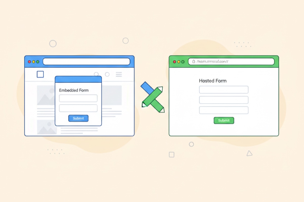
Embed strategically on your website
Where and how you display your lead forms impacts conversions significantly:
Inline forms: Direct and expected
Best placement:
- Dedicated landing pages
- Bottom of high-value blog posts
- Contact or demo pages
- Pricing pages
When to use: High-intent pages where users expect to take action
Popup or modal forms: Attention without disruption
Best triggers:
- After user scrolls 50% of content (engaged readers)
- After 30-60 seconds on page (interested visitors)
- Exit intent (cursor moves to close tab)
- After clicking specific CTAs
When to use: Lower-intent pages where users might not otherwise convert
AskUsers makes it easy to embed forms both ways. You can create inline forms for dedicated landing pages and popup widgets for content pages—all from the same form builder.
Implement exit-intent forms
Catch visitors about to leave with a targeted offer:
Effective exit-intent strategies:
- Offer something valuable (guide, discount, consultation)
- Use compelling copy: "Wait! Before you go..."
- Keep the form ultra-short (email only if possible)
- Make it easy to close (but not too easy)
Exit-intent forms can recover 10-15% of abandoning visitors when done right.
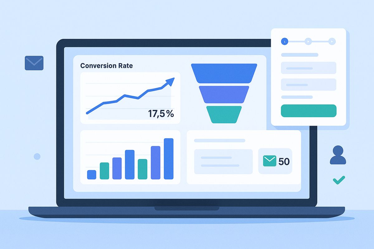
Measuring and optimizing lead form performance
Creating your form is just the beginning. Continuous measurement drives improvement:
Critical metrics to track
Form conversion rate:
- Calculate: (Form submissions ÷ Form views) × 100
- Benchmark: 10-15% is good, 20%+ is excellent
- Track by traffic source for deeper insights
Abandonment rate and drop-off points:
- Which fields cause users to quit?
- At what step in multi-page forms do users leave?
- High abandonment indicates friction or unclear value
Time to complete:
- Shorter is usually better (target under 2 minutes)
- Unusually long times suggest confusion
- Compare across devices and traffic sources
Lead quality metrics:
- What percentage of leads qualify for sales?
- Lead-to-opportunity conversion rate
- Lead-to-customer conversion rate
- Time from lead to closed deal
AskUsers provides built-in analytics showing completion rates, average time to complete, device breakdown, and field-level abandonment data—giving you the insights needed to optimize continuously.
A/B testing strategies for lead forms
Test one variable at a time for clear results:
High-impact tests to run:
1. Form length: 5 fields vs 7 fields
- Often the highest impact test
- Remove "nice to have" fields in variant B
- Measure both quantity and quality of leads
2. Single-page vs multi-step:
- Same fields, different presentation
- Multi-step often wins for 5+ fields
- Include progress indicator in multi-step version
3. Value proposition:
- Test different headlines above form
- Emphasize different benefits
- Try specific vs broad promises
4. Submit button text:
- Generic vs benefit-focused
- "Submit" vs "Get My Free Audit"
- Often yields 5-10% improvement
5. Required fields:
- Make phone number optional
- Test removing company size requirement
- Balance conversion rate with lead quality
6. Form placement:
- Above fold vs below fold
- Inline vs popup
- Sidebar vs center
Interpreting results: Quality vs quantity
A higher conversion rate doesn't always mean success. You need to balance lead quantity with lead quality:
Example scenario:
Form A: 15% conversion rate, 30% of leads qualify for sales
Form B: 10% conversion rate, 60% of leads qualify for sales
With 1,000 visitors:
Form A: 150 leads × 30% = 45 qualified leads
Form B: 100 leads × 60% = 60 qualified leads
Winner: Form B generates more qualified leads despite lower conversion rate
Always track both conversion rate and lead quality metrics. Work with your sales team to understand which leads actually close.
Common lead form mistakes to avoid
Learn from these frequent errors that kill conversions:
1. Asking for information you don't need
Every field should serve a specific business purpose. If you can't articulate exactly how you'll use the information and why you need it now (not later), remove the field.
2. Making phone numbers required
Unless your sales process absolutely requires calling leads immediately, make phone numbers optional. This single change often improves conversion rates by 15-20%.
3. Unclear what happens next
After submission, users should know exactly what to expect:
- When will they hear from you?
- What's the next step?
- How will you contact them?
- What should they do in the meantime?
Add this information to your confirmation message.
4. Poor error messaging
Don't use generic "Invalid input" messages. Be specific:
- ❌ "Invalid email"
- ✅ "Please enter a valid email address (example@company.com)"
- ❌ "Required field"
- ✅ "We need your work email to send you the audit"
Good error messages help users fix problems instead of frustrating them.
5. Ignoring mobile users
If your mobile conversion rate is significantly lower than desktop, you have a mobile optimization problem. Test your form on actual mobile devices and fix friction points.
6. No social proof or trust indicators
Users are more likely to share information when they see others have done so successfully:
- Add testimonials near the form
- Show logos of companies you work with
- Include number of users/customers
- Display security badges for data protection
7. Forgetting to test
Always test your form before launching:
- Fill it out yourself on multiple devices
- Try to break it (wrong formats, leaving fields empty)
- Verify emails arrive correctly
- Check data appears in your CRM or spreadsheet
- Test error states and validation
Industry-specific lead form strategies
B2B SaaS lead forms
Key fields: Email, name, company, company size or role
Strategy: Use multi-step forms with email first. Add qualifying questions about use case or pain points on page 2.
Offer: Product demo, free trial with onboarding, or personalized ROI analysis
Professional services lead forms
Key fields: Email, name, company, service interest, budget range
Strategy: Focus on qualification. Use rating scales ("How urgent is this project?" 1-5) to identify hot leads.
Offer: Free consultation, custom proposal, or industry-specific audit
E-commerce lead forms
Key fields: Email, name (often first name only)
Strategy: Minimize friction—ask for email only if possible. Save preferences for post-signup.
Offer: Discount code, early access to sales, or exclusive content
Consulting and coaching lead forms
Key fields: Email, name, current situation or goal
Strategy: Use open-ended questions to understand needs. Make it conversational.
Offer: Free assessment, strategy call, or personalized action plan
Integrating lead forms with your sales process
Collecting leads is only valuable if you can act on them effectively:
Immediate notification and response
Set up email notifications so your team knows immediately when leads come in. Response time dramatically impacts conversion:
- Leads contacted within 5 minutes are 10x more likely to convert
- After 10 minutes, conversion potential drops by 400%
- After 24 hours, most hot leads have gone cold
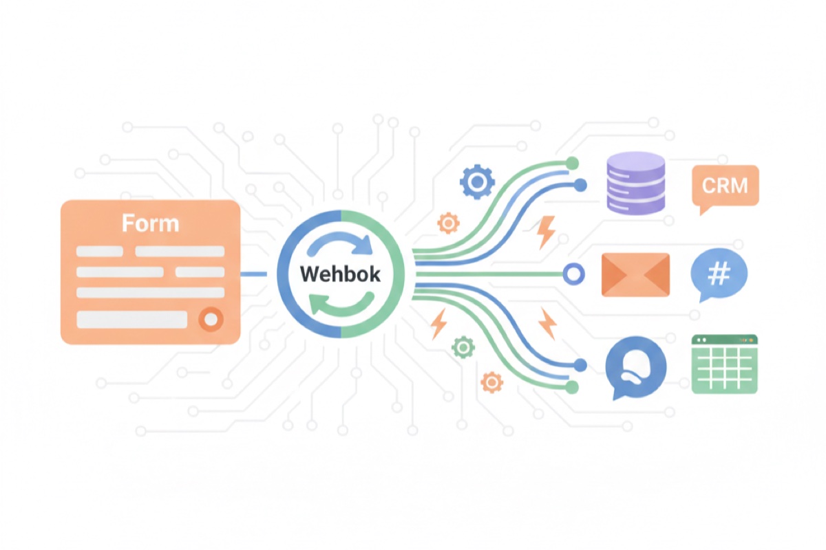
AskUsers sends automatic email notifications with submission details, ensuring your team can respond quickly.
Export to your CRM
Get lead data where your team needs it:
CSV export: Download all leads with timestamps and full response data. Import into your CRM, spreadsheet, or email marketing platform for further analysis and follow-up.
Lead scoring and routing
Not all leads are equal. Use form responses to prioritize follow-up:
High-priority indicators:
- Company size matches your ICP
- Role indicates decision-maker
- Urgency rated high
- Budget aligns with your offering
Create a simple scoring system: assign points to each answer, sum them up, and route high-scoring leads to sales immediately.
Getting started with AskUsers
Now that you understand what makes lead generation forms convert, you're ready to build forms that consistently deliver quality leads.
Why AskUsers is built for lead generation
Multi-step forms with progress indicators: Reduce friction and increase completion rates by breaking long forms into manageable steps.
Flexible field types: From email validation to rating scales for qualification—collect exactly the data you need in the format that works best.
Custom branding: Match your website perfectly with custom colors, fonts, and logos. No generic-looking forms.
Mobile-optimized automatically: Every form looks great and works smoothly on any device without extra configuration.
Built-in analytics: See completion rates, identify drop-off points, and understand which traffic sources deliver the best leads.
Multiple deployment options: Create hosted forms with shareable links or embed directly on your website with popup or inline widgets.
Easy data export: Download your lead data as CSV to import into your CRM, spreadsheet, or any other tool you use.
Next steps
Ready to transform your lead generation results?
- Audit your current forms: List all fields and eliminate those you don't absolutely need now
- Create your first optimized form: Start with AskUsers and build a multi-step form with email first
- Set up analytics tracking: Monitor conversion rates, completion time, and abandonment points
- Test and iterate: Run A/B tests on form length, structure, and copy
- Measure lead quality: Work with sales to track which leads actually convert to customers
High-converting lead forms aren't about tricks or hacks—they're about respecting user experience while collecting the information you need to serve them well.